The big idea: An infographic tells a story with facts and pictures together — numbers, icons, colour and a few words. So you must analyse the visuals as closely as the words.
You've swiped past hundreds — the colourful ‘Did you know?’ posts packed with big numbers and little icons.
A giant ‘8 million’, a red arrow, a tiny wallet leaking coins.
The design isn't decoration — the colour, size and layout are choices, each doing a job.
What to look for
Big numbers
A huge stat grabs the eye and makes the scale feel shocking.
Colour coding
Green = good, red = danger; brand colours for trust.
Icons
A heart, a tree, a warning sign — makes an idea instant.
Visual hierarchy
Size and position decide what you see first — the top, biggest item is the main message.
Big numbers · colour · icons · hierarchy
The key move: Show how a word and a visual work as a pair: ‘rising’ beside an upward red arrow makes a threat feel unstoppable. Always ask: what does the design add?
Free preview
This is the free notes preview
You're reading the free notes. Aimnova Pro unlocks the full study experience — and you can try it with your first topic free to keep:
- FlashcardsLock in vocabulary and key terms with spaced repetition.
- Practice questionsAnswer exam-style questions and get instant AI marking.
- Mock exams & past-paper vaultSit full mocks and see exactly how examiners award marks.
- Personalised study planA daily plan built around your exam date and weak areas.
Why it matters in the exam: An infographic can be set in Paper 1 as the page itself. A strong answer analyses the design choices (colour, size, icons, layout) alongside the words.
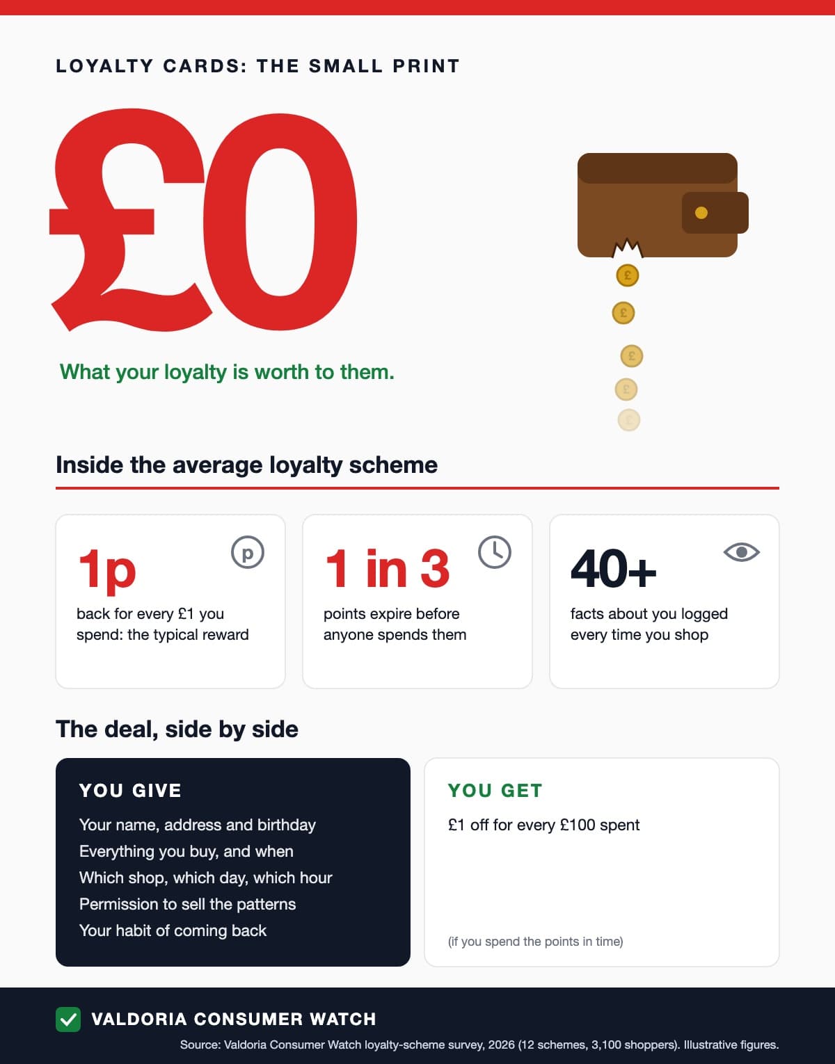
Analyse how this infographic uses visuals and words to persuade shoppers.
Model answer plan
See the mark-by-mark plan — for / against / judgement, with marking guidance — in study mode.
Watch out: Don't analyse only the words — the visuals are half the text. And ‘it uses colour’ means nothing without the meaning attached.