In a nutshell: A website is built to be scanned, not read — headings, images and buttons guide your eye and your click, so its design does much of the persuading.
You land on a homepage and decide in two seconds whether to stay.
A big heading, a smiling photo, one bright ‘Sign up free’ button. You don't read it — you scan it, and your eye is steered exactly where they want it.
A web page persuades through layout: what's biggest, what's a button, what speaks straight to ‘you’.
What to look for
Headings for scanning
Short bold headings let you skim; you rarely read every word.
A clear call to action
A bright button — ‘Start now’, ‘Buy’, ‘Join’ — is the click they want.
Direct address
‘You’ and ‘your’ everywhere, speaking to each visitor personally.
Image + layout hierarchy
The biggest, top-most, brightest thing is what they want you to see first.
See it drawn, step by step
In My Learning, handwritten diagrams build one step at a time. Play, pause and replay each explanation until it clicks. Create your free account to try it.
The key move: Ask ‘where does the design send my eye — and my click?’ A web page persuades through hierarchy and calls to action, not paragraphs.
Free preview
This is the free notes preview
You're reading the free notes. Aimnova Pro unlocks the full study experience — and you can try it with your first topic free to keep:
- FlashcardsLock in vocabulary and key terms with spaced repetition.
- Practice questionsAnswer exam-style questions and get instant AI marking.
- Mock exams & past-paper vaultSit full mocks and see exactly how examiners award marks.
- Personalised study planA daily plan built around your exam date and weak areas.
Why it matters in the exam: A web page can appear in Paper 1. A strong answer analyses the design choices — headings, buttons, direct address, what's placed first — and how they steer the visitor.
When the guiding question points here: A website is a non-literary text (the guide lists electronic texts; its list is not exhaustive), and web pages have been set in recent papers. Guiding questions have asked how text and image promote an experience, and how a page's features promote its subject: read the page in the order a visitor scans it.
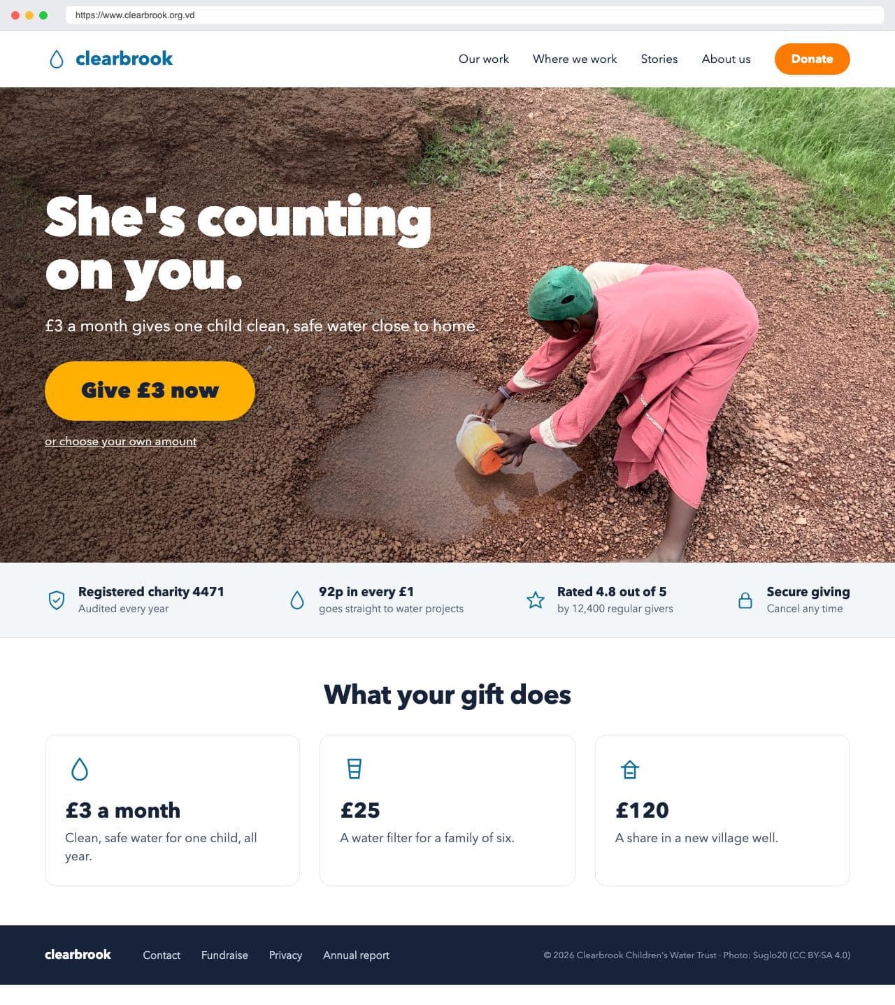
Analyse how this charity homepage uses design and words to persuade visitors to give.
Model answer plan
See the answer broken into clear points, with guidance on how each point earns marks.
Watch out: Don't analyse a web page as if it were an essay to read top to bottom. Analyse how the design guides scanning — what's biggest, what's a button.
Two kinds of web page in past papers: Recent Paper 1 web pages either sold an experience (a trip or event to book) or promoted a subject (a place, cause or organisation). Experience: show how text and images put you there. Subject: show how the page makes it seem important and trustworthy.