How waste varies at Higher Level: The same statement as SL, with different real cases: world waste to 2050, waste per person by region, the Maldives, China's 2018 import ban and China's incinerators. At HL, link each factor to an economic or political choice someone made.
Practise this as you read
- Name the factor behind each change.
- Explain a data pattern with reasons that fit it.
Free preview
This is the free notes preview
You're reading the free notes. Aimnova Pro unlocks the full study experience — and you can try it with your first topic free to keep:
- FlashcardsLock in vocabulary and key terms with spaced repetition.
- Practice questionsAnswer exam-style questions and get instant AI marking.
- Mock exams & past-paper vaultSit full mocks and see exactly how examiners award marks.
- Personalised study planA daily plan built around your exam date and weak areas.
More, and different, over time: The amount of waste a society makes, and what that waste is made of, does not stay the same.
Waste over time
- The volume of waste changes over time: the world made 2.01 billion tonnes in 2016.
- It is projected to reach 3.40 billion tonnes by 2050: about 70% more.
- The composition changes too: more plastic, packaging and e-waste than before.
- Plastic piles up: it does not biodegrade, so each year's plastic adds to the last.
- Percentage change = (new - old) / old x 100.
- Mean per year = total / number of years. Always give the unit.
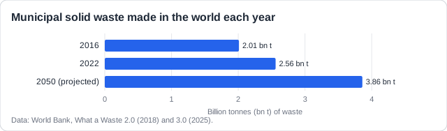
Real example: the World Bank's newer survey counted 2.56 billion tonnes of waste in 2022 and projects 3.86 billion tonnes by 2050 if nothing changes: up about 50% in under 30 years.
Remember it as: Over time: more waste, and more of it plastic.
See how examiners mark answers
Answer exam-style questions with model answers. Learn exactly what earns marks and what doesn't.
Waste also differs from one society to another, at the same moment in time: in its amount per person and in what it is made of.
Waste between societies
- Richer societies make more waste per person: North America 2.21 kg a day, Sub-Saharan Africa 0.46 kg.
- High-income countries have 16% of the world's people but make 34% of its waste.
- Poorer societies throw away more food and green waste: 56% (low income) v 32% (high income).
- Richer societies throw away more dry waste: paper, plastic, metal, glass (51% v 16%).
- Waste grows fastest where incomes, populations and cities are growing fastest.
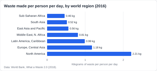
Real example: in 2016 a person in North America made 2.21 kg of waste a day; a person in Sub-Saharan Africa made 0.46 kg. Africa's total is still projected to nearly triple by 2050, as incomes and cities grow.
Four kinds of factor: The guide sorts the causes into four groups. Learn one real example of each.
The four factors
- Socio-economic: income, population growth, cities, shopping habits, tourism.
- Political: laws, taxes, bans, and how well they are enforced.
- Environmental: climate, seasons, disasters such as floods and storms.
- Technological: new products and gadgets, packaging, how goods are made and waste is measured.
- Name the factor, then link it to more or less waste, or a different mix.
| Factor | How it changes waste | Real example |
|---|---|---|
| Socio-economic | Tourists add waste where they visit | The Maldives' resorts send rubbish to Thilafushi, an island waste site |
| Political | Trade rules decide where waste ends up | China's 2018 ban on imported plastic waste |
| Environmental | Storms and floods make sudden waste | Hurricane Maria (2017) left Puerto Rico with huge piles of debris |
| Technological | Cheap plastic replaces glass, metal and paper | Plastic made each year: about 2 Mt (1950) to 460 Mt (2019) |
Real example: when China stopped importing most plastic waste in January 2018, countries such as the UK and the USA had to keep, burn or bury plastic they used to ship abroad: a political factor in one country changed waste in another.
Study smarter, not longer
Most students waste 40% of study time on topics they already know. Our AI tracks your progress and optimizes every minute.
Societies also differ in what they do with their waste, and the papers test this with a bar chart of disposal methods by income.
Disposal varies with income
- Low-income countries dump most waste in the open: 93%.
- As incomes rise, landfills replace dumps: 54% of waste in upper-middle-income countries.
- In high-income countries landfill falls to 39%; incineration (22%) and recycling rise.
- Why: landfills and incinerators cost money; richer countries can afford them and the technology.
- Land is expensive in rich, crowded places, so waste is burnt or recycled instead of buried.
- Education and changing values push for greener methods.
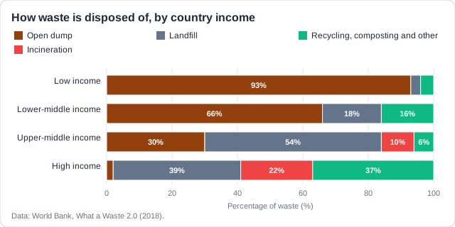
Up, then down: Landfill use rises from low to upper-middle income, then falls to high income. Describe both parts for both marks, and give reasons that fit the part you describe.
Real example: as China's income rose it built many incinerators: incineration in upper-middle-income countries rose from about 0.1% to 10% of waste, mostly because of China.
Reading waste data: Most waste questions give you a graph or a table. These are the skills they test.
Reading waste data
- Describe a trend: its direction, numbers from the graph, and any change of direction.
- Estimate from a graph: read the axis carefully and give the unit.
- Plastic used does not decide plastic reaching the sea.
- What matters is collection: countries that collect and treat their waste leak little.
- Also rivers that carry waste, people living near the coast, and laws that are enforced.
- Waste data are often estimates: they may be inaccurate or biased.
Real example: Japan uses a lot of plastic packaging per person, but it collects almost all of its household waste and burns much of it in incinerators, so little of it reaches the sea.
Same income, different waste: If two countries have the same income, income cannot explain their gap. Use laws, charges, campaigns, home composting, tourism, imported packaging or values instead.
Practice with exam-style questions
Answer exam-style questions and get AI feedback that shows you exactly what examiners want to see in a full-marks response.
How this comes up: Paper 2, Section A: a table comparing countries, then a four-mark Explain on why two things do not match.
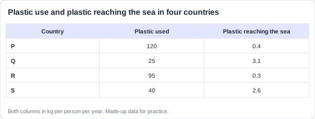
Figure 1 shows how much plastic four countries use and how much reaches the sea.
Explain why the data in Figure 1 show no correlation between plastic used and plastic reaching the sea.
Model answer plan
See the mark-by-mark plan — for / against / judgement, with marking guidance — in study mode.