A population in one picture: An age-sex pyramid models the composition of a population. You can compare two populations by putting their pyramids side by side.
The points to remember
- A pyramid is a model of a population's composition: males and females in each age group.
- Age groups go up the middle in 5-year bands, youngest at the bottom.
- Males on the left, females on the right.
- Bar length is an absolute number (e.g. thousands) or a percentage of the total population.
- Percentages let you compare countries of different sizes; absolute numbers show the real size.
- Each bar is a cohort: in 5 years' time it moves up one band.
Remember it as: Young at the bottom, old at the top; men left, women right.
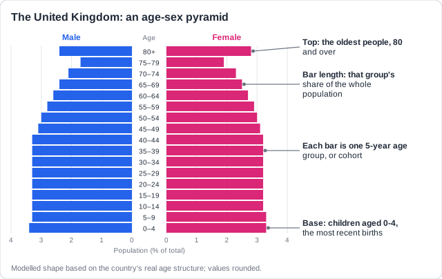
Real example: the UK has about 67 million people, and nearly one in five is over 65. Each bar is a cohort: the people aged 0-4 today will be the 5-9 bar in five years' time.
Read the scale first: Check whether the bars show thousands of people or a percentage. To compare a large and a small country, use percentages.
Free preview
This is the free notes preview
You're reading the free notes. Aimnova Pro unlocks the full study experience — and you can try it with your first topic free to keep:
- FlashcardsLock in vocabulary and key terms with spaced repetition.
- Practice questionsAnswer exam-style questions and get instant AI marking.
- Mock exams & past-paper vaultSit full mocks and see exactly how examiners award marks.
- Personalised study planA daily plan built around your exam date and weak areas.
The outline of a pyramid shows whether a population is growing, steady or shrinking. There are three basic shapes.
The points to remember
- Expanding: wide base, concave sides, narrow top: high births, high deaths, a young population.
- Stationary: straight sides until old age: low births, low deaths, long life expectancy.
- Contracting: base narrower than the middle, wide top: births below replacement, an ageing population.
- Describe in order: base, middle, top, then any bulge or notch, and the sexes.
- Describe first (what you see), then explain (why).
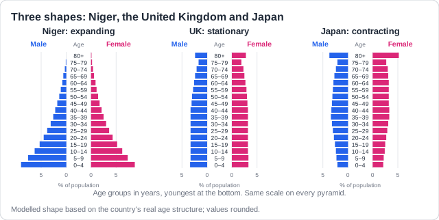
Real examples: Niger (expanding: average age about 15, women have about 6 children), the UK (stationary), Japan (contracting: about 29% of people are 65 or over).
Concave, not just narrow: Say how the sides curve: 'concave sides' (bending inwards) mean many people die at each age, as in an expanding pyramid.
Study smarter, not longer
Most students waste 40% of study time on topics they already know. Our AI tracks your progress and optimizes every minute.
To explain a shape, take each feature in turn and give the reason for it. One feature with its reason is one point.
The points to remember
- Narrow base = a falling birth rate: women's education and careers, contraception, the cost of children.
- Also for a narrow base: lower child mortality (fewer births needed), less child labour, anti-natalist policies.
- Wider middle = people born when birth rates were higher, now moving up.
- Wider top = longer life expectancy from better health care and living conditions.
- More women than men at the top: women outlive men.
- A notch in the young adult bars = young people emigrated.
Remember it as: Base = births, top = life expectancy, notches = people leaving.
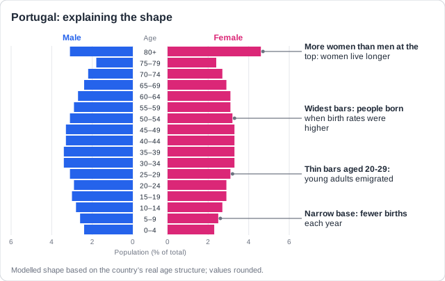
Real example: in Portugal women have about 1.4 children, so the base is narrow. During the 2011-2014 economic crisis over 100,000 people a year emigrated, most of them young adults.
Feature AND reason: 'The birth rate is falling' alone is not enough: say why (women's education, contraception, the cost of children). And 'education' must be women's education or sex education.
Migration, wars, disasters and baby booms leave marks on a pyramid. Migration changes the working ages most, because most migrants are young adults looking for work.
The points to remember
- Emigration of working-age adults cuts the 20-44 bars: the sides go concave there.
- Often more men leave, so the male side is cut more.
- Fewer young adults means fewer births: the 0-4 bar shrinks a little later.
- Immigration of workers adds a bulge in the working ages, often mostly men.
- A baby boom makes a bulge that moves up; a war or epidemic cuts a notch.
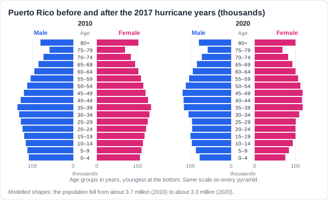
Real example: after Hurricane Maria in 2017, many young Puerto Ricans moved to the USA. The population fell from about 3.7 million in 2010 to about 3.3 million in 2020, and fewer babies were born.
Drawing a pyramid after an event
- Keep the same axes and labels: age groups, male, female, the population scale.
- Copy the original shape, then change only the bars the event affects.
- Show the change clearly: much shorter bars where people left.
Practice with exam-style questions
Answer exam-style questions and get AI feedback that shows you exactly what examiners want to see in a full-marks response.
A pyramid also lets you predict. Today's large cohorts are tomorrow's parents and, later, the elderly, so the shape tells you what comes next.
The points to remember
- Large young cohorts will reach child-bearing age, so the population keeps growing for a while.
- A narrowing base means fewer future parents: slower growth later.
- Fertility may fall below replacement (about 2.1 children per woman).
- More people reaching old age: an ageing population and a higher average age.
- More older people for each person of working age to support.
- When births and deaths become equal, the population becomes stable.
Remember it as: Today's children are tomorrow's parents and, later, the old.
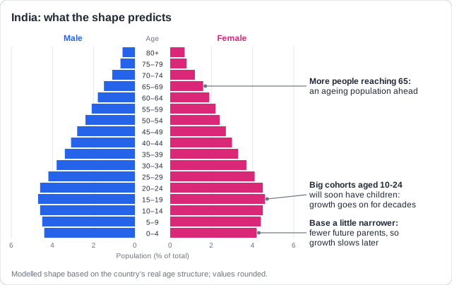
Real example: India's women now have about 2 children each, yet its population of about 1.4 billion is expected to keep growing until the early 2060s, because its large young cohorts are now having children.
To compare two pyramids, describe each difference, then give its reason in the same sentence.
The points to remember
- Describe the difference, then give its reason: one point each.
- Wider base: more births, from little contraception, less education for women, and farm work.
- Wider top: lower death rates, because of better health care and sanitation.
- Notches or bulges: migration, policies such as an anti-natalist law, wars.
- Check the units: one pyramid may be in millions, the other in thousands.
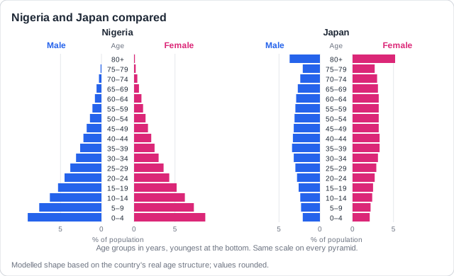
Real example: Nigeria's base is far wider than Japan's because Nigerian women have about 5 children and few use modern contraception, while Japanese women have about 1.2. Japan's top is wider because health care gives a life expectancy of about 84.
Not a reason: 'It is less developed', 'it has more land' and 'a healthier lifestyle' alone do not explain a difference. Name the cause: contraception, women's education, health care, farm work or policy.
Feeling unprepared for exams?
Get a clear study plan, practice with real questions, and know exactly where you stand before exam day. No more guessing.
Planners use pyramids to see what a population will need. A pyramid is also a model, with strengths and limits.
The points to remember
- Young pyramid: more schools, food, jobs and homes needed soon.
- Ageing pyramid: more health care, pensions and care homes; fewer schools.
- Stabilising: little extra demand for resources.
- Births still above deaths: still growing, so pressure on resources rises.
- Emigration: less demand; tourists and temporary workers: more water and land.
Young pyramid
- More schools and teachers
- More food and clean water
- Jobs and homes in 15 years
Ageing pyramid
- More health care and care homes
- More pensions
- Fewer schools and workers
Real example: Nigeria must find school places for millions more children every year, while Japan closes hundreds of schools a year and needs more care homes and carers.
The pyramid as a model
- Strength: shows the whole structure at a glance.
- Strength: lets you compare places and years, and plan future needs.
- Limit: a snapshot of one year; it does not show the causes.
- Limit: 5-year bands hide detail; migrants are mixed in with everyone else.
Not just 'more people': 'More people use more resources' alone is not enough: name the age group and the resource, e.g. 'fewer children, so fewer school places are needed'.
How this comes up: Paper 1: a country's age-sex pyramid. Explain the possible reasons for its shape [3].
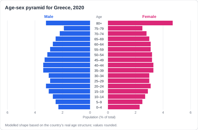
Figure 1 shows the age-sex pyramid for Greece in 2020. Greek women have about 1.3 children each, and many young adults left the country during an economic crisis after 2010.
Explain the possible reasons for the shape of the pyramid in Figure 1.
Model answer plan
See the mark-by-mark plan — for / against / judgement, with marking guidance — in study mode.