People add carbon dioxide faster than nature removes it: Anthropogenic carbon dioxide comes mostly from burning fossil fuels.
The points to remember
- Anthropogenic = caused by human activity.
- Burning fossil fuels (coal, oil, gas) for power, transport and industry: the largest source.
- Cement making releases CO2 from limestone as well as from the fuel burned.
- Deforestation: burning or rotting trees release their stored carbon...
- ...and the forest can no longer take CO2 in: a double impact.
- A source adds CO2 to the air; a sink takes it out (forests, oceans, soils, peat).
Sources (add CO2)
- Burning fossil fuels
- Deforestation and burning
- Cement production
- Respiration and decomposition
Sinks (take CO2 out)
- Forests (photosynthesis)
- Oceans (CO2 dissolves)
- Soils (organic matter)
- Peat bogs
Remember it as: Burn it, clear it, bake it: fuel, forests, cement.
Real example: Brazil's satellite survey found that the Amazon lost more than 10,000 km² of forest every year from 2019 to 2021. Each cleared hectare releases its stored carbon and stops taking CO2 in.
Free preview
This is the free notes preview
You're reading the free notes. Aimnova Pro unlocks the full study experience — and you can try it with your first topic free to keep:
- FlashcardsLock in vocabulary and key terms with spaced repetition.
- Practice questionsAnswer exam-style questions and get instant AI marking.
- Mock exams & past-paper vaultSit full mocks and see exactly how examiners award marks.
- Personalised study planA daily plan built around your exam date and weak areas.
How do we know the CO2 in the air is rising? It has been measured directly, every day, since 1958.
The points to remember
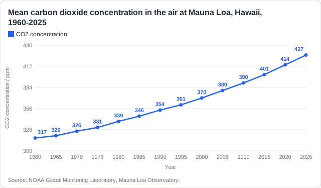
- CO2 has been measured at Mauna Loa, Hawaii, since 1958: the Keeling curve.
- It has risen every year: from about 317 ppm in 1960 to about 427 ppm in 2025.
- Before the Industrial Revolution it was about 280 ppm.
- The rise is speeding up: about 0.9 ppm a year in the 1960s, about 2.4 ppm a year in the 2010s.
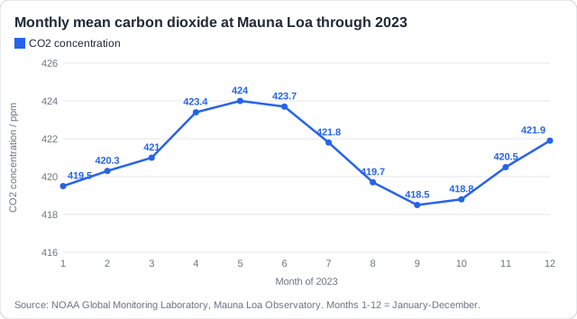
- The yearly zigzag: CO2 falls in the northern summer as plants take it in, and rises in winter.
Real example: the American scientist Charles David Keeling began the measurements in 1958 on Mauna Loa, a volcano in Hawaii, about 3,400 m up and far from cities and forests, so the air there is well mixed.
Never wonder what to study next
Get a personalized daily plan based on your exam date, progress, and weak areas. We'll tell you exactly what to review each day.
The rise in CO2 can be traced back to one turning point: the Industrial Revolution.
The points to remember
- The rise began with the Industrial Revolution in late 18th-century Britain.
- Coal powered steam engines, factories and railways; in 1800, Britain made 96% of the world's fossil CO2.
- Industry spread through Europe and North America in the 1800s; by 1900, the USA emitted the most.
- In the 20th century, oil, cars and electricity spread across the world.
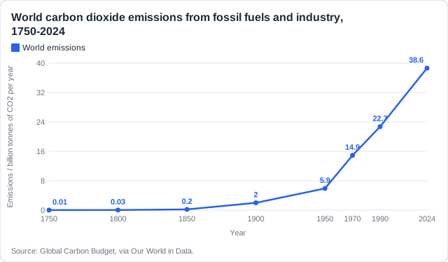
- World fossil CO2 emissions: about 2 billion tonnes a year in 1900, 5.9 in 1950, 38.6 in 2024.
- So the rate of emission accelerated, above all since 1950.
Real example: in 1800, Britain's coal mines and steam engines produced 96% of the world's fossil CO2. By 1850, as industry spread to other countries, Britain's share had fallen to 62%.
Two dates to remember: Late 1700s: the rise begins (Britain, coal). After 1950: the great acceleration (the whole world).
Why did emissions speed up so much after 1950? Each reason is a link: more of something that burns fossil fuel, so more CO2.
The points to remember
- Industrialization spreading to more countries: new factories and fossil-fuelled power plants.
- Population growth: about 2.5 billion people in 1950, about 8.2 billion in 2024.
- Rising standard of living: more cars, electricity, air travel and goods per person.
- Intensive, mechanized farming that runs on fossil fuels, in place of traditional farming.
- Burning forests to clear land for farms and cities.
- Some rich countries now emit less per person as they switch away from coal.
Real example: India's CO2 emissions rose from about 1.0 billion tonnes in 2000 to about 3.1 billion in 2023, as coal-fired power stations, factories and car ownership grew with its economy and population.
A reason needs a link: 'China's economy' is half a reason. 'A rapidly growing economy means more fossil-fuelled power plants and factories, so more CO2' is a full reason.
Stop wasting time on topics you know
Our AI identifies your weak areas and focuses your study time where it matters. No more overstudying easy topics.
Papers give a chart of emissions and ask for a percentage change or a mean yearly increase.
The points to remember
- Percentage change = (new - old) / old x 100.
- Mean yearly increase = (last value - first value) / number of years between them.
- Read values carefully from the graph, then show your working.
- Give the unit: %, ppm, or million tonnes of CO2 a year.
- A fall is a negative change: say 'a decrease of...'.
Percentage change
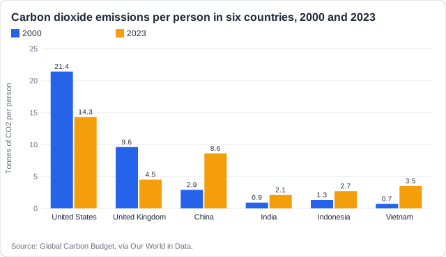
Vietnam per person: (3.5 - 0.7) / 0.7 x 100 = 400% increase.
Mean yearly increase
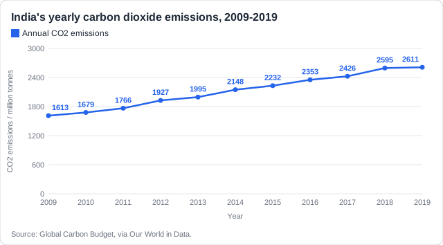
India: (2,611 - 1,613) / (2019 - 2009) = 998 / 10 = about 100 million tonnes a year.
A decrease
UK per person: (4.5 - 9.6) / 9.6 x 100 = -53%, a decrease of 53%.
Show it: Write the subtraction and the division, then the answer with its unit. A bare number can lose the mark.
How this comes up: Paper 2, Section A: a chart of emissions per person in two years, then a percentage change [1] and 'Identify two possible reasons' for one country's change [2].
Countries are developing at different speeds. The figure shows the carbon dioxide emissions per person of six countries in 2000 and 2023.
Identify two possible reasons for the change in CO2 emissions per person for India.
Model answer plan
See the mark-by-mark plan — for / against / judgement, with marking guidance — in study mode.