
No diagram = no top marks. This is non-negotiable in IB Economics.
Below is the exact step-by-step method examiners expect. Follow it every time and you'll earn full marks for the diagram.
Step 1: Draw demand and supply
- Draw two axes: vertical = Price (P), horizontal = Quantity (Q)
- Draw demand curve downward sloping, label it D
- Draw supply curve upward sloping, label it S
- Mark the original equilibrium: P1 and Q1
Step 2: Shift the supply curve
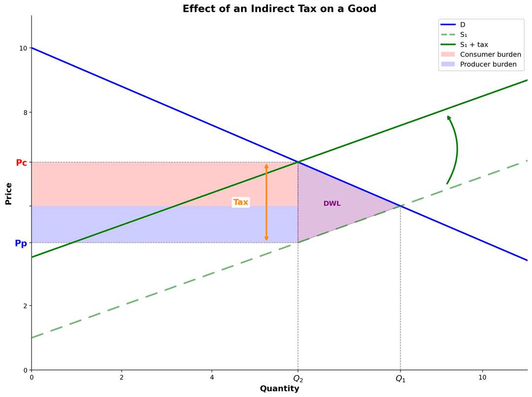
The tax is imposed on producers, so the supply curve shifts upward (to the left) by the amount of the tax.
- Draw a new, parallel supply curve above the original
- Label it S + tax or S1 (if you use S1, explain it's the new supply curve after tax)
Step 3: Mark the new equilibrium
Where the demand curve intersects the new supply curve (S + tax):
- Mark on price axis: Pc (price consumers pay) — HIGHER
- Mark on price axis: Pp (price producers receive) — LOWER
- Mark on quantity axis: Qt (new quantity) — LOWER
The vertical distance between them = the tax per unit. This distance should equal the size of the supply shift.
Step 4: Shade the tax revenue rectangle
Draw a rectangle (shaded in light colour) showing tax revenue:
- Top edge: at Pc (price consumers pay)
- Bottom edge: at Pp (price producers receive)
- Width: Qt (new quantity)
- Height: Pc − Pp (the tax per unit)
Label this area: "Tax revenue" or just "TR" so the examiner knows you understand what it represents.
Step 5: Shade the deadweight loss triangle
To the right of Qt, between the demand and new supply curves, draw a small triangle and shade it with a different colour.
Label it: "DWL" (deadweight loss) or "Welfare loss"
This triangle shows the loss of beneficial trades — transactions that would happen at the old price but don't happen at the new, higher price.
Critical labeling rules
| Element | Label it as | Why |
|---|---|---|
| Price axis | P (not "Y" or "Price $") | Standard economics convention |
| Quantity axis | Q (not "X" or "Number") | Standard economics convention |
| Original price point | P1 and on a demand-supply intersection | Shows before-tax equilibrium |
| New price (consumers pay) | Pc (must be higher than P1) | Shows tax burden on consumers |
| New price (producers receive) | Pp (must be lower than P1) | Shows tax burden on producers |
| New quantity | Qt (must be lower than Q1) | Shows quantity falls after tax |
Diagram checklist
More IB Economics guides
Build your IB Economics revision cluster
Need more than one article? Explore the IB Economics study hub or browse all IB Economics blog posts so your practice, revision, and exam technique all connect.
Ready to put your IB knowledge to the test?
Try a full-length mock exam with real IB-style questions and instant marking — or browse our question bank to practise topic by topic.