
The 10-mark question is part (a) of every Paper 1 question — at both SL and HL. The command term is almost always "Explain". You choose one out of three questions, and you have roughly 20–25 minutes to answer.
This guide is focused on SL Paper 1. If you are an HL student, see our separate HL 10-Mark Economics Guide which covers both Paper 1 part (a) and Paper 3 part (b) "Recommend" questions.
What a 10-mark "Explain" requires
- Pure theory — no stimulus material or data is given
- Your own examples and diagrams — you must supply them
- Full explanation — describing is not enough; you must explain why and what happens as a result
- No evaluation required — unlike part (b), you only need to explain, not evaluate
Assessment criteria — applied to a real question
The marking scheme for 10-mark questions uses five bands. Let's see what each band looks like for this specific question:
Explain how the existence of common access resources may lead to market failure.
[10 marks]
| Marks | What examiners expect | What this looks like for this question |
|---|---|---|
| 1–2 | Little understanding. Terms stated but not relevant. | Vaguely mentions "common resources" or "market failure" without explaining either. |
| 3–4 | Some understanding. Theory described but not explained. | Defines common access resources. States "they are overused" but doesn't explain the incentive mechanism or use a diagram. |
| 5–6 | Demands partly addressed. Theory partly explained. Diagram included. | Explains the link between no ownership and overuse. Draws MSC/MPC diagram but doesn't fully explain it. May mention externalities. |
| 7–8 | Demands understood and addressed. Theory explained. Diagram(s) included and explained. | Explains why rational self-interest leads to negative externality. Diagram is drawn, labelled, and explained (MPC≠MSC, overproduction Qm>Qopt). Uses a basic example. |
| 9–10 | Demands fully addressed. Theory fully explained. Diagram(s) fully explained. | All key terms defined. Full cause-effect chain: no ownership → incentive to overuse → MSC>MPC → overproduction → welfare loss. Diagram fully explained with DWL triangle. Real-world example developed. Consequences explained. |
The ideal structure — 5 steps
- Define key terms (1–2 sentences) — shows immediate understanding
- Explain the economic theory — cause-and-effect chain with clear logic
- Draw and explain a diagram — label all axes, curves, equilibria; refer to it in your text
- Give a real-world example — connects theory to reality
- Extend the explanation — consequences, implications, or why it matters
Full model answer — paragraph by paragraph [10 marks]
Below is a 9–10 band answer to the question above. Each numbered paragraph shows how marks are built up — aim for this level of depth and structure.
Model answer (9–10 band)
① Define key terms
Common access resources (also called common pool resources) are resources that are rivalrous— one person's use reduces availability for others — but non-excludable, meaning no one can be prevented from using them. Examples include ocean fish stocks, forests, and clean air.
② Define the second key term
Market failure occurs when the free market fails to allocate resources efficiently, resulting in a loss of economic welfare. In this case, the market failure arises because common access resources have no defined ownership and therefore no price mechanism to signal scarcity.
③ Explain the incentive problem
Because there is no owner to charge a price, individual users have an incentive to maximise their own consumption. A fishing company will continue to increase its catch because the private marginal cost (MPC) of fishing does not include the cost imposed on other fishers or on the ecosystem.
④ Identify the externality
This creates a negative externality of production: the marginal social cost (MSC) of extracting the resource exceeds the MPC. The difference between MSC and MPC is the external cost — the damage to the ecosystem and to other users that the individual firm does not pay for.
⑤ Introduce and explain the diagram
This can be shown on the diagram below. The market produces at Qm where MPC = MSB (demand), because firms only consider their private costs. However, the socially optimal output is Qopt where MSC = MSB. At Qopt, all costs — including external costs — are accounted for.
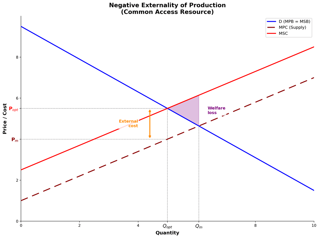
⑥ Explain the welfare loss from the diagram
The resource is overconsumed by Qm − Qopt. For every unit between Qopt and Qm, the MSC exceeds the MSB, meaning society pays more than it benefits. The shaded triangle represents the deadweight loss (DWL) — a permanent loss of economic welfare that cannot be recovered.
⑦ Real-world example
A clear example is overfishing in the North Atlantic. Because ocean fish are a common access resource with no single owner, fishing fleets competed to catch as much as possible. By the 1990s, cod populations in the Grand Banks collapsed to less than 1% of historical levels, devastating both the ecosystem and the fishing industry itself.
⑧ Explain the "tragedy of the commons"
This pattern is known as the tragedy of the commons: each user acts rationally in their own self-interest, but collectively the resource is degraded or permanently depleted. The market failure exists because there is no price signal to reflect scarcity or environmental damage.
⑨ Conclude — why this is market failure
Therefore, common access resources lead to market failure because the absence of ownership and prices creates a divergence between private costs and social costs. The result is allocative inefficiency — the resource is consumed beyond the socially optimal level — and, without government intervention such as quotas, tradable permits, or taxation, the resource will continue to be overused and potentially exhausted.
Common mistakes that cost marks
- Not defining key terms: Definitions show immediate understanding — examiners cannot award top-band marks without them
- Describing instead of explaining:"MSC is above MPC" is description. Explaining why MSC exceeds MPC (because individual firms ignore external costs) is what earns marks
- Unlabelled or unexplained diagrams: A diagram drawn but never referenced in your text is worth very little. Every axis, curve, and equilibrium must be labelled and woven into your explanation
- No real-world example: Top-band answers always include a specific example that connects theory to reality
- Too short: A 10-mark answer needs substantial depth — aim for 300–400 words with a diagram
Quick checklist
| Check | For 7–8 | For 9–10 |
|---|---|---|
| Key terms defined | ✓ | ✓ |
| Theory explained (not just described) | ✓ | ✓ fully |
| Diagram drawn, labelled, and explained | ✓ | ✓ fully explained |
| Real-world example | Basic | Developed in context |
| Consequences explained | — | ✓ |
More IB Economics guides
Build your IB Economics revision cluster
Need more than one article? Explore the IB Economics study hub or browse all IB Economics blog posts so your practice, revision, and exam technique all connect.
Ready to put your IB knowledge to the test?
Try a full-length mock exam with real IB-style questions and instant marking — or browse our question bank to practise topic by topic.